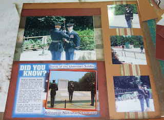
Using another layout from Magic and the single Flip Flaps. These pics were of various things we saw that I really didn't have enough pics of any one thing to make a full layout of each individual thing. So I grouped them together and I like the final outcome. Still using up those old embellishements! I'm actually getting low on letters, so I combined some for my title. And if I hadn't told you that, you'd thought I did it on purpose!! I like the "eclectic" look of it!
Tuesday, August 31, 2010
Monday, August 30, 2010
Ta Da
Using the name of the layout in Magic I used as inspiration as my title! While it started out frustrating when I could not get the template to download on the new 'puter, turned out to be a fun layout once we figured out that I cannot download PDF files with the free "trial" version of Microsoft Office. So we ended up downloading the file on John's laptop. The swirly doo-dad that the title is on on the first page is the template that gave me so much grief! But darn well worth it I say! I used the bricks in the Around The Block stamp set for my Brickwork title. The embellishments are from very old, long discontinued CTMH Dimensional Elements. Not that I hang onto or hoard supplies. No. Not me. I could probably never buy another thing as long as I live and STILL have stuff left when I die.
Saturday, August 28, 2010
Friday, August 27, 2010
Arlington
For this layout, I for the most part, let the pictures speak the words. It is such a sobering thing to watch the changing of the guard. I didn't do a lot of journaling and I didn't add a lot of embellishments. Now that I've used the new CTMH Flip Flaps, I LOVE them even more than I thought I would. I wanted the impact of the changing of the guard on a two page layout. I didn't want it spread out over five or six pages. The Flip Flaps helped me accomplish that. This is one of my all-time favorite layouts I've ever done.
Thursday, August 26, 2010
Feelin Froggy
We've had quite a bit of rain in our neck o' the woods since last Saturday. And you won't hear one word of complaint out of me. I've dumped almost 8" of rain in total since Sat. I'm sure there's now better than 8" because it was raining when I went to bed last night and rained almost all night. Yesterday morning, we had a brief respite and I took advantage of it to go mow. The grass has been loving the moisture and has gone into growth overload. Before I started mowing, I wanted to dump the rain gauge. I found this little fellow inside. I dumped the gauge and he was still hanging on inside! I knew he'd drown if he stayed in there, so after a few persistant taps, he finally came out.
Wednesday, August 25, 2010
More National Harbor
Using the new CTMH Magic layout design book that will be available for customers to order from on Sept 1 for most of these layouts. I'm such a nerd. I brought the bag home that I got at the Peeps store because I planned to use it on one of the pages! So that one doesn't have a lot of other stuff on it so I could remember how pretty and unique the bag was! The other one, the layout is called On With The Show, and yes, it's a postcard!
Tuesday, August 24, 2010
It's yer birthday!
And I needed a card! And Michelle at http://www.cardpatterns.com/ created another lovely sketch for us to use this week.
This is CTMH Sweet Home paper pack. Chipboard letters are Scenic Route. Crochet flower is CTMH.
This is headed for my mom, who will be 39 AGAIN next week. She says she found an age she liked and is sticking with it!
Monday, August 23, 2010
Saturday, August 21, 2010
Vacation layouts
Been working on a couple of different projects to be revealed in a bit. In the meantime, here are the beginning pages of vacation layouts. I'm using CTMH Passages paper pack and various embellishments. Some I know what company they came from and others, notsomuch! If there's something in particular you want to know what it is, leave me a comment or drop me a line and I'll try to figure out what it is! One thing I will say is that the title for the "Sand Art" pages, I used old Scenic Route chipboard letters and sanded them, then went out back and got some sand out and after randomly adding Glossy Accents to the sanded letters, I dipped them in the sand! I thought that was the most ingenious thing I've come up with in a long time! It takes a lot for me to impress me and I did on this one!
Wednesday, August 18, 2010
First Birthday
Needing a first birthday card, I used the http://www.cardpatterns.blogspot.com/ sketch for this week. I used CTMH Expeditions paper pack along with Fun Times, Happy Birthday and Solo 1 stamp sets. The number is pop dotted for dimension.
Tuesday, August 17, 2010
Accordion Album
When my nail gal's son in law saw the Accordion Albums I did for E and her daughter, he asked how much I'd charge him to make him a 6 x 6 album with Army papers for his soon to be newborn son. Well, he's over in Afghanistan protecting MY freedom...no way in hell am I charging him. I ordered the papers and Army stickers from http://www.scrapyourtrip.com/ and as always, likety split on the shipping and a coupon for 10% off my next purchase! I did block their name in the first pic.
Monday, August 16, 2010
That's mah boy!
Saturday, August 14, 2010
Suite!
We had an opportunity to attend the Rays-Orioles game last night and sit in the Pepsi Suite. For FREE! Well, I'm no dummy! You betcha we were there! There were 15 other Frito employees who took advantage of the offer. We had free soda in the Suite, but were responsible for buying our own food and beer. It was 70's Throw Back night with the Village People performing a concert after the game. (and now we'll ALL be singing YMCA for the rest of the day!!) We did not stay for the concert since John had to work this morning, but everything was 70's themed! The Rays wore jersey's based on the old Tampa Tarpons of the minor leagues since the Rays's weren't playing in the 70's. The Orioles had on their orange and black uniforms from the 70's. The "macho man" from the Village People got to throw out the first pitch. Rays third baseman Evan Longoria was chosen to recieve the Heart and Hustle Award, which was presented to him before the game started. Each major league team has one person who recieved this award. I think I decided that the ideal job for me would be running the tractor and pulling the "sled" behind it to smooth out the base paths after batting practice! That's a job I could get into!!
Wednesday, August 11, 2010
Swap Cards
With the introduction to Consultants of a new Idea Book, it's also time for Favorite 3rd Upline Susan's team swap. I decided to do THREE rounds in this one because we've got Christmas stamps and papers in this book, so why not do a round of Christmas cards in addition to my "normal" two rounds of everyday cards?!
For the Christmas card, I used new Mistletoe paper pack. CTMH moved back to a more traditional color pallet this year with Cranberry, New England Ivy, Chocolate and Garden Green. I used a non-traditional stamp set called Harmony. I LOVED this cardinal from my first glance thru the book and knew I had to have the set! There's some Create A Shade paint colored with Cranberry ReInker to color the holly berries. I used Wishes-Pieced Together for the template.
Second is Magnifique paper pack. This one uses three of our new colors, Pacifica, Lagoon, Sky and Chocolate. I used the Workshop On The Go guide for this layout. John picked his favorite of the three card designs from the WOTG and that's what I used. This one also uses our new Licorice Opaques and Sparkles-Blue and Green for the flower centers. The butterfly was made with a flower stamp that is then cut apart and a photo clip is used for the body.
Last, but in no way least is Hooligans! Our bright, colorful funky and fun Halloween paper. It uses four of the new colors; Gypsy, Lagoon, Pear and Sunset. The little felt fellows are a Level 2 add on. You get 6 adhesive backed Hooligans for $4.95! The card is a Pop-Up Slider card.
Subscribe to:
Posts (Atom)